
The New Table Builder Experience in SAP Analytics Cloud (SAC) introduces a more intuitive, faster, and flexible way to build analytical tables. Whether you are a Business Analyst, Dashboard Designer, or Planning Expert, the The New Table Builder Experience in SAP Analytics Cloud (SAC) introduces a more intuitive, faster, and flexible way to build analytical tables. Whether you are a Business Analyst, Dashboard Designer, or Planning Expert, the redesigned builder streamlines how you structure dimensions, measures, filters, and linked analysis.
This update is especially beneficial for:
- Faster table creation with simplified drag-and-drop
- Better support for structured and hierarchical dimensions
- Enhanced sorting, ranking, thresholds, and in-cell charts
- A more consistent design aligned with the Charts Builder Panel
- Consistent UX aligned with the Charts Builder for easier designer onboarding.
- Improved structured dimension handling (ranges, parent nodes, totals, group breakdown).
- Add-ons & in-cell visuals (linked analysis, thresholds, hyperlinks, mini charts) to make insight consumption faster.
- Error & warning surface in builder to prevent misconfigurations before publishing.
This new builder greatly improves productivity in planning stories, financial reports, and interactive dashboards, resulting in better insights and faster decision-making.
Convert ODE to New Table Builder Experience
Why convert from ODE to the New Table Builder Experience? (Business benefits)
Converting to the New Table Builder delivers immediate business value:
One-click downstream consumption (example): Generate Excel stories or export-ready tables with fewer steps — enabling finance teams to get formatted Excel outputs quickly and reducing manual rework.
Faster authoring, lower cost of design: Drag-and-drop table construction and a structured builder reduce time-to-delivery for dashboards and reports.
Consistent UX across visuals: Aligning table design with the Charts Builder shortens the learning curve across designers and centralizes best practices.
Stronger analytical capability: Enhanced sorting & ranking, structured dimension support, and in-cell visuals make it easier to surface actionable insights.
Better manageability: The new Client Calculations panel centralizes formulas for easier debugging, re-use, and governance.
Improved reliability: Errors and warnings shown inside the builder prevent misconfigurations before publishing.
How to Convert ODE tables to the New Table Builder Experience
Use this as a guide for authors migrating tables. Replace screenshot placeholders with real images from your SAC tenant.
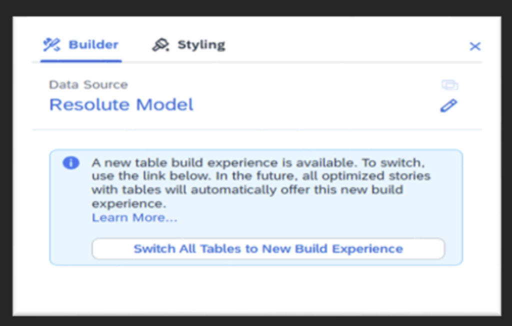
Step 1 — Enable the Optimized Design Experience (if not already)
On the top toolbar, toggle Optimized Design (this gives access to the new builder)
Open your Story in SAC.
Step 2 — Insert or select the existing table
- If converting an existing table, click the table on canvas.
- If creating new, use Insert → Table and place an empty table widget.
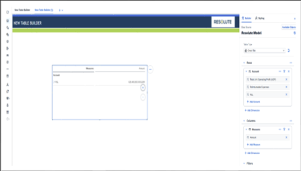
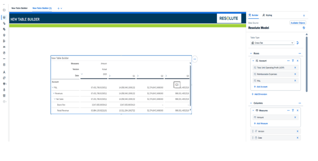
Step 3 — Open the New Table Builder panel
- With the table selected, the Table Builder Panel appears (Available Objects, Rows, Columns, Add-Ons, Errors).
- Expand the sections so you can clearly see Available Objects (dimensions, measures, accounts, versions).
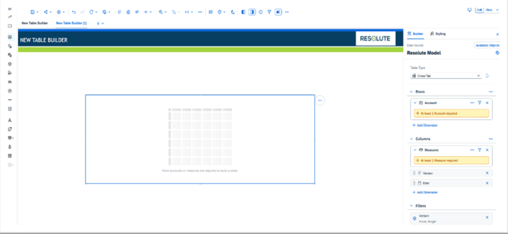
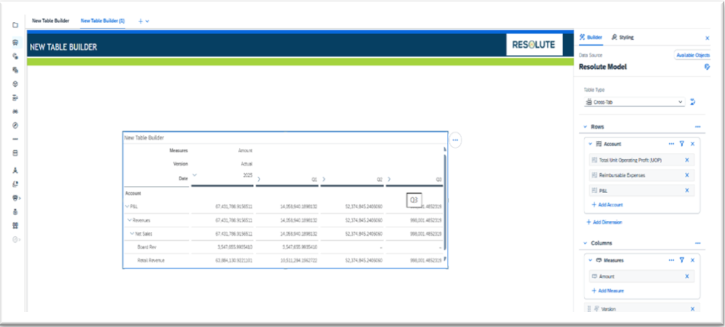
Step 4 — Recreate structure using Rows & Columns
- Drag dimensions and measures to Rows and Columns to mirror the original table.
- Use the Available Objects area to search and place members (booked members, IDs).
- For hierarchical reporting, add parent nodes or totals from the structured-dimension settings.
Step 5 — Configure Structured Dimensions
- Open a dimension’s settings: set Range, Parent node selection, and Totals visibility.
- Use group breakdowns for nested reporting (P&L, cost center hierarchies).
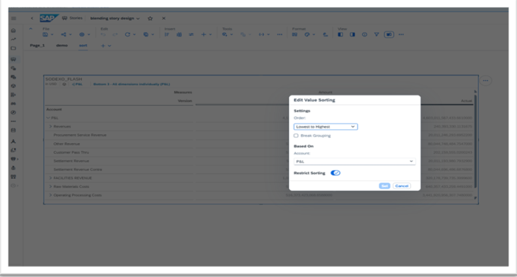
Step 6 — Apply Sorting & Ranking (new behaviour)
- Open Sort & Rank dialog inside the builder.
- Choose Sort by (dimension/member/measure) or Rank (replaces Top N).
- Optionally restrict sorting to a specific version (Actual, Plan, Forecast).
- Apply ranking across all dimensions or one-by-one as required.
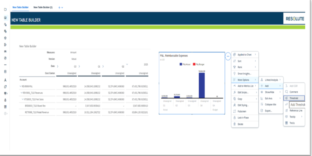
Step 7 — Add Add-Ons: In-cell charts, thresholds, linked analysis
- Use Add-Ons to insert in-cell charts (mini bars/lines), thresholds, hyperlinks, and linked analysis.
- Configure tooltip and threshold behaviours for clearer visual cues.
Step 8 — Migrate Calculations to Client Calculations Panel
- Open the Client Calculations panel to create or move existing formulas.
- Add formulas like growth %, variance (Actual vs Plan), running totals, and custom KPIs.
- Use formula visibility and one-click navigation to jump to the related cell — verify results.
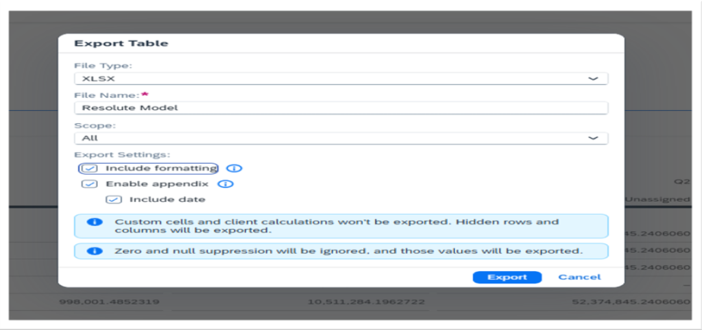
Step 9 — Publish & Generate Excel Story (one-click workflow)
- After validation, switch to View mode and preview the table.
- Use the Export / Generate Excel Story option (or the tenant-specific “Generate Excel” feature) to create a formatted Excel output.
- Confirm the Excel story preserves in-cell charts and formats (if supported) or apply final Excel template formatting.
Limitations Of Converting From SAC Web Story To Excel Report
Scope “All” Doesn’t Always Work Correctly
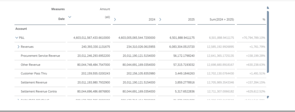
- In Story 2.0 + “View” mode, when you choose “Scope = All” for XLSX export, hierarchical data (e.g., from BW Live) may only export parent nodes, not the full structure.
- For older stories, “All” might not be supported for Excel export — export behaves like “Point of View” only.
Browser Memory Limits → Crashes
- Exporting large stories (many pages or big tables) in “Optimized Design Experience” (ODE) can cause the browser to run out of memory, and the export fails.
- Because export happens in-browser, your computer’s memory matters a lot.
Cell / Data Volume Limits
- XLSX export has a cell limit: you can’t export more than 500,000 cells for “Point of View.”
- For “All” scope, the documented limit is 1.5 million cells.
Formatting & Structure Loss
- Styling (like cell background colour, font style) is not exported.
- Hyperlinks in tables are removed in the Excel output.
- Hierarchical dimensions are flattened during export — you lose the tree structure.
- Custom cells (cells outside the main data region of the table) are not exported.
- Any “story-formula” calculations or custom formula cells may not come into the export.
Decimal-Place / Number Formatting Limits
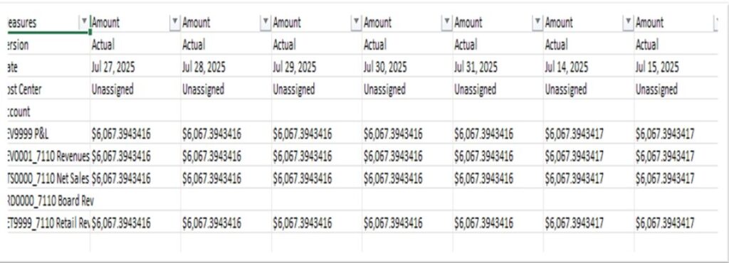
- The exported numbers maintain the same number of decimal places as shown in the story. If in the story you have rounded values, Excel will get the rounded ones.
- If you need more precision than what is shown in the story, you need to adjust the story styling (decimal places) before export.
Performance Issues with Live Data (e.g. BW Live)
- Exporting from a BW Live model can be very slow, because SAC has to download all the data client-side before creating the file.
Export Failures or Errors
- There are known bugs: for instance, in some versions, trying to export a table (XLSX) in “Point of View” causes nothing to be exported, with no error shown.
- Also, after upgrades, users sometimes face the error: “…more than 20 exports started” or it just hangs.
Add-On / Widget Limitations
- Custom widget add-ons might not export fully or correctly to PDF / PPTX / Excel — especially styling may be lost.
Excel Add-In (SAC → Excel) Specific Limitations
- When you pull a story table into Excel using the SAC Excel add-in, some story features aren’t supported:
- If you renamed dimensions or members in the story, the original model names appear in Excel, not the custom ones.
If you had “break grouping” when sorting in the story, Excel will respect that, but you can’t re-sort in Excel in the same way.
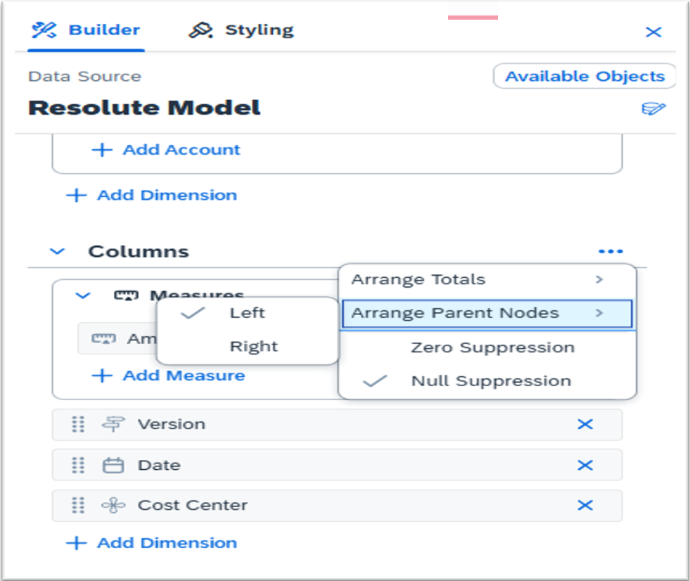
NEW TABLE BUILDER PANEL
The new Table Builder Panel in SAC introduces a more modern, intuitive, and streamlined experience for building analytical tables. It aligns closely with the Charts Builder, offering a consistent design across story components. The panel displays key areas—Available Objects, Rows, Columns, and Add-Ons—in a structured layout that makes table construction faster and more logical. Users can drag and drop measures, dimensions, and versions to build tables with ease. The panel also includes controls for structured dimensions, thresholds, linked analysis, and in-cell charts. Additionally, error and warning messages are surfaced directly inside the builder, helping designers spot misconfigurations early and avoid broken tables.
New Features:
- Redesigned panel aligned with the chart builder for consistent UX
- Drag-and-drop interface for rows, columns, and fields
- Expanded support for structured dimensions (range, parent node, totals)
- Quick access to linked analysis, thresholds, hyperlinks, in-cell charts
- Error & warning messages shown directly inside the panel
- Cleaner separation of available objects and builder areas
- Ability to handle complex tables more efficiently
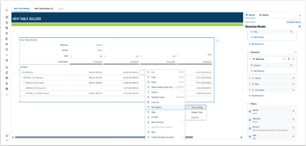
SORTING AND RANKING ENHANCEMENTS
The new Sorting and Ranking enhancements in SAC significantly improve how users analyze large and complex datasets. Designers can now sort data by any dimension, measure, or version with more precision and flexibility than before. The updated dialog allows sorting across rows or columns and supports advanced options like restricting sorting to a particular version or measure. Ranking, which now fully replaces the old Top N feature, lets users generate ranked insights across all dimensions or within each dimension individually. This is especially beneficial for business scenarios such as identifying the Top 10 performing regions, highest revenue products, or lowest cost centers. These enhancements make it easier for both business users and analysts to derive meaningful insights quickly while maintaining full control over sorting logic.
New Features:
- Sort by dimension, member, or measure
- Sort restricted to specific version (Actual, Plan, Forecast)
- Ranking replaces Top N, offering more flexibility
- Apply ranking across all dimensions or dimension-by-dimension
- Improved UI for selecting values regardless of context
- Better handling of grouped and hierarchical tables
NEW CLIENT CALCULATIONS PANEL
The new Client Calculations Panel centralizes all calculations in a single, easy-to-navigate interface within the Table Builder. Instead of searching through table cells or formula fields, users can now view, edit, and manage every calculation from one structured panel. The panel provides full formula visibility, clear naming conventions, and a visual indicator for calculated fields. Users can also directly jump to any cell linked to a calculation, making the troubleshooting process much faster. This improvement helps both technical and non-technical users create sophisticated calculations such as variance percentages, running totals, growth rates, and custom KPIs without confusion or unnecessary clicks.
New Features Included:
- Centralized view of all calculations in one panel
- Formula visibility for easier debugging and editing
- Calculation indicator beside tokens for quick identification
- Edit number formats directly within the panel
- One-click navigation to the cell where the formula is applied
- Cleaner naming and organization for better maintainability
Conlusion
Converting from ODE to the New Table Builder Experience gives teams faster table authoring, stronger analytics, and better governance of calculations. The structured panel, powerful sorting/ranking, centralized calculations, and add-ons (in-cell charts, thresholds, and linked analysis) deliver both designer productivity gains and clearer, more actionable outputs for business consumers. For finance and planning teams, the ability to generate polished Excel stories with fewer steps is an immediate productivity win — reducing manual work and accelerating decision cycles. Use the step-by-step guide above, take screenshots at each stage, and validate outputs in a staging story before rolling changes to production.
The New Table Builder Experience listed in this blog post are current as of Q3 2025. Updates and new features are frequently released by SAP. For the most recent information, consult the official SAP Analytics Cloud documentation.