
The Data Analyzer in SAP Analytics Cloud (SAC) is a built-in analysis tool that allows users to quickly explore data from models and datasets. It provides an ad-hoc, table-based analysis experience where users can drag and drop dimensions, apply filters, create calculations, and drill into details. It is designed for fast, flexible, self-service analysis—ideal for business users who want to view, slice, and investigate data without needing technical modeling skills.
- Supports direct access to SAP BW queries and HANA views, ensuring high data accuracy through live connections.
- Works seamlessly with both planning models and acquired models, providing a unified space for data exploration.
- Allows users to explore both model types using the same drag-and-drop interface in Data Analyzer.
- Enables easy analysis of relationships, identification of variances, and navigation through hierarchies, regardless of how the data was created.
- Simplifies navigation by automatically generating an analysis view, allowing users to start exploring data immediately without designing dashboards.
With features like drill-downs, conditional formatting, calculations, bookmarks, and filter context handling, it enables fast, interactive, and ad-hoc analysis suitable for both technical and non-technical users.
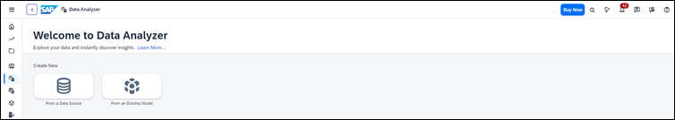
Launch Data Analyzer
Data Analyzer can Launch in three ways
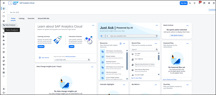
Form Data Analyzer Menu
Data Analyzer can be accessed by using the side navigation of SAP Analytics Cloud
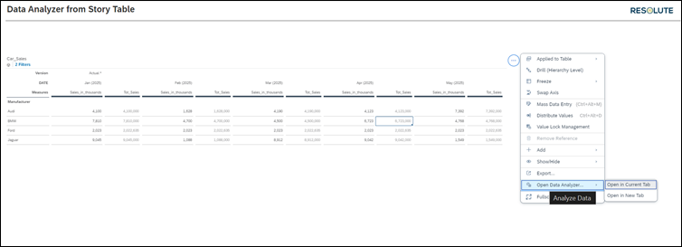
Form Story Table
Data Analyzer can be accessed Through Story-Table.
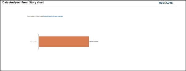
Form Story Chart
Data Analyzer can be accessed through Story-chart
Technical Details of Data Analyzer
The Data Analyzer in SAC is built as an ad-hoc analysis interface that automatically opens with a predefined model, query, or dataset—removing the need to design a story. Here are its key technical capabilities:
Supported Data Sources
- SAC Models (both planning & analytical)
- SAP BW Queries (live connection)
- SAP HANA Views (live connection))
Core Functional Features
Drag and Drop Dimensions & Measures into Rows, Columns and Filters
One of the biggest strengths of Data Analyzer is its simple drag-and-drop interface, which allows users to shape their analysis exactly the way they want—without writing formulas or building a story layout.
In Data Analyzer, your table is controlled by three key areas:
1. Rows
Placing a dimension (such as Account, Cost Center, Region, Product, or Customer) in the Rows area defines how data is broken down vertically.
Example: Drag Manufacturer to Rows → You get a row-wise breakdown values by each manufacturer.
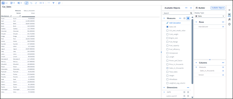
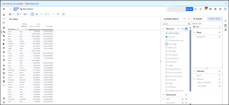
2. Columns
Placing measures (such as Revenue, Expense, Quantity, Headcount) in the Columns area builds your KPI structure horizontally. You can also add dimensions to columns if you want cross-tab breakdowns.
- Example: Drag Curb Weight and Sales in thousand to Columns → You see side-by-side KPI comparison
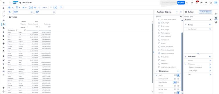
3. Filters
Dragging fields into the Filters section narrows down the analysis to the data you actually want to explore.
- Example: Drag Time → Filter for “2025”
- Drag Version → Select “Actuals” only
Filters help finance teams stay focused on the exact scenario, period, or version they are reviewing.
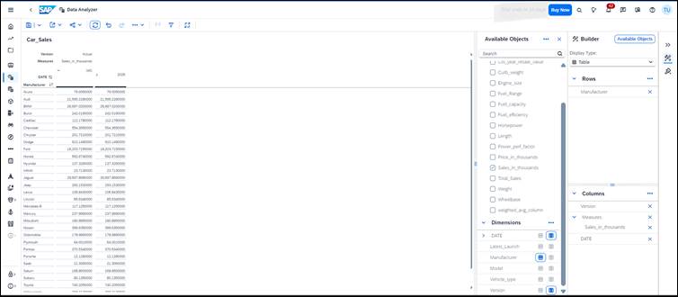
Drill-Down / Drill-Up Across Hierarchies
Data Analyzer makes it easy to navigate layered financial structures using drill-down and drill-up features. Most finance-related dimensions—such as Account, Cost Center, Profit Center, Region, or Product—are organized in hierarchies. Drill navigation lets users move smoothly between summary-level and detailed-level information without leaving the analysis screen.
1. Drill-Down
Drill-down allows users to move from a summary view to a more detailed breakdown with a single click.
Example: Clicking on Dates expands it into detailed view in year/month of 2025.
This helps analysts quickly analyse the data.
2. Drill-Up
Drill-up brings the user back to a higher-level summarized view.
- Example: After analyzing individual all details, you can drill up to see the 2025 and 2026.
This makes it easy to zoom out and get back to the big picture.
Adding Custom AdHoc Calculations using Data Analyzer
- The Data Analyzer allows users to create quick, on-the-fly calculations without modifying the underlying model.
- Useful for adding additional metrics such as percentages, variances, and ratio-based KPIs for analysis.
- To create a custom ad-hoc calculation:
- Open the model in Data Analyzer.
- Go to the Measures panel.
- Select Create Calculation to open the formula builder. Example: Creating a “Revenue Growth %” calculation:
- Add Current Revenue and Previous Revenue measures into the formula editor.
- Apply the formula: (Current Revenue – Previous Revenue) ÷ Previous Revenue.
- After validating the formula, assign a name and save the calculation.
- The new measure appears immediately in the Measures list and can be dragged into rows, columns, or filters like any standard measure.
- This feature enables users to extend their analysis dynamically without waiting for changes at the model level.
Sharing Adhoc Insights
- SAP Analytics Cloud Data Analyzer allows users to save their analysis as reusable insights, ensuring work is never lost.
- Customized views with dimensions, filters, hierarchies, or calculations can be saved as Insights and reopened later without rebuilding.
- Saved insights can be shared with team members, promoting consistent reporting across the organization.
- Based on permissions, colleagues can view, interact with, and refine the saved insights.
- Ensures that everyone works from a common, up-to-date analytical view.
- Positions Data Analyzer as a collaborative space, not just an exploration tool, enabling smooth flow of insights across the team.
Tips & Tricks for Using Data Analyzer Effectively
Use Bookmarks to Save Your View
- If you frequently analyze the same KPIs or months, save a bookmark instead of rebuilding every time.
Enable Hierarchies for Clear Financial Drilldowns
- Turn on account or cost centre hierarchies to see roll-ups clearly.
Use Compact Display for Cleaner Tables
- This reduces space and makes financial statements easier to read.
Apply Member Filters Instead of Story Filters
- Member filters give more granular control when analyzing planning versions or cost centre segments.
Use Calculated Measures for Quick Variance Analysis
You can quickly create formulas like:
- Actual vs Plan
- Year-over-Year Change
- Contribution %
Export to Excel for Offline Reviews
Finance teams often need excel-based audit trails—Data Analyzer supports this.
| Feature | Description |
| Purpose | Provides a quick, ad-hoc analysis space for exploring data without designing full dashboards. |
| Data Sources Supported | Works with both Planning models (editable) and Acquired models (read-only). |
| Interface | Table-focused layout with drag-and-drop for dimensions, measures, filters, and hierarchies. |
| Calculations | Allows users to create custom ad-hoc calculations directly within the analyzer. |
| Saving & Sharing | Users can save views as Insights and share them with team members for collaboration. |
Conclusion
The Data Analyzer in SAC is a highly efficient tool that blends speed, flexibility, and accuracy—making self service a reality for SAC users. There is no need to create too many canned reports, instead built a minimum set of canned reports and enable users to build their personalized reporting views on and on-demand basis.